Tuesday, 11 May 2010
Sunday, 9 May 2010

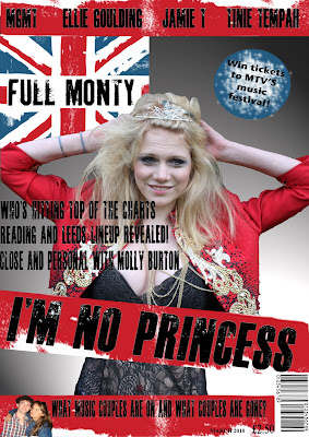
This is my Front cover finished for my music magazine, I have use a large image to occupy a decnet amount of space so that readers are not put off by large amounts of text, this is because my target audience of teenagers would not find lots of text appealing. The colour scheme of red blue and white represents the magazines British theme and the black writing goes well with the solour scheme as it is easy to read and stands out. I have used media conventions such a barcodes, price, dates, pugs, headlines, tagline, skylines and banners and a masthead. These make my magazine more professional and will more likely boost the chances of it being published and distributed. I have included new british artists on my skyline as it relates to my magazines theme which is young and new British music, the banner also includes gossip, this appeals to my audience as many teenagers are interested in gossiping. My taglines are all stories which make you want to read more, meaning more people will want buy the magazine to read into the contents. The headline also does not give too much of the story away also meaning you will have to buy the magazine to find out what the full story is. The pug also does this, influencing people to buy the magazine as a good prize is available which would appeal to many. My masthead is also placed in the top corner big enough to stand out to readers so they are aware of what magazine they are looking at, also promoting the magazine.
Stages of Front Cover

Here is my finished contents page, I have used conventions such as broken down text to make it easier for readers to find what they are looking for. Page numbers have been used to enusre readers can find a certain content in my magazine easily, the issue date is included as are images and subcribtions. Subscriptions are another way I can distribute my magazine, selling more and by offering a cash prize to people who suscribe persaudes readers to do this, making my magazine get my money by selling more copies. The images and layout of my contents appeal more to 16 to 18 year olds as it takes away too much attention to the text which puts off many teenagers, it also makes my contents more interesting and when people may flick through the magazine quickly before pruchasing it it will jump out at them as it is eye catching through the editing of images and layout and colour.
Stages of Contents

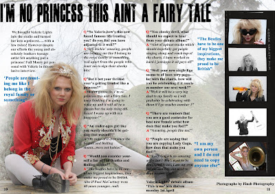
Here is my finished double page spread, the image is effective as the editing use of the dodge tool has lightened the background making her the center of attention and makes the writing easier to read. The use of enlarged quotes also persuade the readers to read the interview as many people do not like large amounts of text, I picked out the most effective qoutes which would ensure people would want to read further into the interview. I have also positiioned my text so that it does not cross the centre line so all text is visible and easy to read. I have also enlarged a quote as the headline as it is from her point of view and will appeal to readers as it gives a sense of comfort and similiarality between the aritst and the readers. The film strip down the side is also to take away so much attention away from the text and its vintage and retro look is up to date with teenage interests today. I have included page numbers at the bottom, real conventions of media and named who took the photography sometimes a case of conventions in media magazines.
Stages of Double Page Spread
Sketches
For the sketches I have decided to use the skatech with the main image in the center of the page and the masthead on the left hand side, with no picture and text to make it too busy, this is becuase I feel my tagkines and headline and main image will stand out more and my magazine will look proffesional. I have included all conventions of real media products such as barcodes, prices and dates and looked at other music magazine layouts for inspiration. I feel by using this my front cover will be very effective and eye catching, qualities I need for my music magazine to sell.
For the sketches I have decided to use the skatech with the main image in the center of the page and the masthead on the left hand side, with no picture and text to make it too busy, this is becuase I feel my tagkines and headline and main image will stand out more and my magazine will look proffesional. I have included all conventions of real media products such as barcodes, prices and dates and looked at other music magazine layouts for inspiration. I feel by using this my front cover will be very effective and eye catching, qualities I need for my music magazine to sell.
Fonts.
For my magazine I wanted my font to be appealing to attract attention, I used a website named wwww.dafont.com where thousands of fonts are available, I also used fonts alreayd on the computer for my double page spread. Here are some examples of the ideas of fonts I was going to use....
Fonts
For my magazine I wanted my font to be appealing to attract attention, I used a website named wwww.dafont.com where thousands of fonts are available, I also used fonts alreayd on the computer for my double page spread. Here are some examples of the ideas of fonts I was going to use....
Fonts
Subscribe to:
Comments (Atom)


