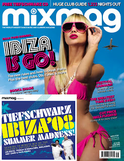
For this magazine it has used brighter colours to rock magazines such as NME and KERRANG, the bright colours indicate that this magazine is not a rock music magazine and could be for a more upbeat type of music such as dance music. The bright colours give off a bright and happy mood, for example the bright blue sky and bright pink and yellow, they could be associated with happiness. The main image on this front colour also gives off this impression and it shows a women on holiday where most people are happy at whilst they are on holiday. For the design of the magazine the words and image fit together as the largely written information on the Ibiza summer madness CD and text about summer parties, the image fits with this as the women in the bikini is dressed for a holiday in the summer, the aeroplane in the background of the image also suggests the music magazine is based around club and dance music. The font also seems to resemble perhaps lighting which would be used in clubs as it is styled similar to a certain lighting effect. The masthead also stands out in contrast of the bright white and blue, making the magazines name clear and attract the audiences attention.
The image resembles this type of music magazine, which appears to be deditcated to dance music and club anthems as the women is wearing skimpy clothing which is portraying the typical 'clubbing' stereotype who wear skimpy clothing whilst on a night out. This type of music also originates from holiday places and thereforE her wearing the bikini and sunglasses shows this. The women can also be seen as a sex symbol which appeals to the male audience and also dance and club anthem music videos use attractive women therefore it gives us an idea that this magazine is targetted to clubbers and dance music listeners.
The pose on the front of this magazine is quite a sexual, appealing to male readers and showing us the genre of the magazine. The long blonde hair also resembles the stereotypical music video girl who appears in this genre of musics videos. Her bright and bold coloured lipstick also emphasizes the sexual image that is being portrayed, appealing to male readers as her pose and makeup is very seductive and appealing to females as it is what some may aspire to be? it also appeals to the stereotypical club and dance music listeners.
The words used on the cover such as the title of the magazine appeal to a certain audience as mixmag connotes that this magazine is dance and club anthem music as they often mix tracks together to make this genre of music. At a glance it is clear to see what the contents of this magazine are as the strap lines are clear and suggest what is inside the magazine, the words festivals and club guide also appeals to a targetted audience of young adults as that is the lifestyle of that age group lead. This wording will stand out on a shelf to young adults as the clubbing and festival guides will appeal to them. There is also a lot of information on Ibiza flights at cheap prices appealing to readers as ibiza is known as a party place and is well known for its nightclubs.
The language such as summer madness addresses the target audience as it is a fun and playful word and stand out to young adults as at this that age it is the only time of their lifetimes where they can party excessively. The language used is also not very formal, suggesting it is for young readers and a casual fun magazine.
My overall impression of this magazine as that the strap lines and masthead give a clear indication of the contents of this magazine, the colours, language, words and images also appeal to young readers through their connotations and interests of readers.

No comments:
Post a Comment