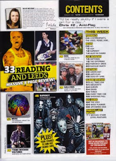
Kerrang have stuck to three main colours, black white and yellow. These colours are used frequently throughout the magazine, they are bold and striking which catches audiences attention. The yellow is also used as a highlighter to emphasize certain points, this is a suitable colour for this as the writing is still visible.
There are many images used on this contents page all showing band members giving the audience indication of who will be featuring in the magazine. All the artists in the images appear to be rock artists, showing KERRANG is a rock music magazine, the use of more than one image and them being scattered accros the left hand side of the page also makes the magazine look less formal and more like a rock music magazine.
The contents of the magazine has been narrowed down into groups to make it easier for the readers to find the page number. An enlarged quote is used using very informal language, "I'd be really slutty if I were a girl for the day", this is quite a humourous quote and will make readers want to read further into the magazine. Certain text is in a bigger font, this is so that the audiences attention is drawn to them, for example the reading and leeds festival news, a music festival which Kerrang readers would be interested in.
This magazine has included an editors letter which we have not seen in Vibe or NME magazine, this is to give the audience almost a 'friendship' between the editor and themseleves, also again making the magazine less formal. The use of many images using most of the page also draws in attention and the text is set out easily to be read.

No comments:
Post a Comment