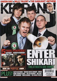
The colours used are an off white, black, green and red, these are all unisex colours and are also quite dark and ‘grungy’ colours, this shows it is a rock music magazine as these colours give off that impression. The colour scheme of the magazine matches the image. The masthead KERRANG looks as if it has been smashed in the lettering, this suggests it is a rock music magazine as it could be related to the typical rock band who smash their instrument and are ‘head bangers’, the exclamation at the end of the masthead title also emphasizes loudness, related to loud rock music.
The image used is a rock/scream band, this relates to the genre of the magazine. The rosette which each member of the band is wearing with the dragon in the middle is the bands logo, which also matches the colour scheme of the magazine cover. The use of the mega-phone also suggests that the band are loud and megaphones are used to perhaps shout down and get someone’s attention, this relates to Enter Shikari’s style of music. It also relates to the genre of the magazine.
The band are all acting out certain movements with their hands, this movement can be seemed as ‘hard’ and harsh almost like the genre of music. The words on the front of this cover are large and bold, the connotation of this could be that rock music is quite loud and striking the font size and type could reflect the genre of the music magazine, relating to the readers interests. The size and layout of the text is easy to read at first glance, this is more likely to catch readers’ attention. There is not a lot of text in this front cover, however the text which is on the cover includes the cover lines which is the main story inside the magazine, strap lines which only mention band names this could intrigue people and make them want to read further by just focusing on main story lines. The words “the streets are ours” come across as cocky, loudmouthed and seem appropriate as it is a rock band saying it, whereas if a youth was to say this it may seem inappropriate.
My overall impression of this front cover is that the sky line gives us an indication of who is featured in the magazine, as does the text at the bottom of the magazine, which could be seen as subheadings? However it only mentions the names of the artists and does not state what information on them will be included in the magazine. The main point of focus is the large and striking image which gives the audience a clear understanding that this issues main article is on enter shikari. The way the layout, design, text, language and image all have been designed to appeal to rock music listeners as they represent that specific audiences interest through connotation.

No comments:
Post a Comment