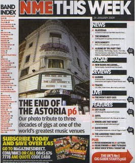
NME has chosen to use their house style colours for their contents page, this makes their magazine more professional and the white background used with bright lettering over the top makes text stand out. The colours have been seperated across the page, organised so that the red lettering stays on the left.
The image is shown at a low angled viewpoint, when we read the text below the image, we notice this is because this famous music venue is closing down and will be missed by many people, including music artists/bands and people who came to this venue to listen watch gigs. The high angled shot shows its importance and how many people are fond of the venue.
The contents page layout is 'tidy', certain information safely placed across the page. NME have enlarged their main article and placed in the middle of the page, this is to draw the audiences attention to this article. All of the contents in the magazine is listed on the left and side to show page numbers so that readers can turn straight to that content of the magazine. Some of the stuff included in this magazine have also been summerised into groups and listed on the right hand side. This is perhaps to make it easier for the readers to find what thy want to read. A pug is placed at the bottom of the page used for advertisement and audience attention to buy their magazine regularly.

No comments:
Post a Comment