Tuesday 11 May 2010
Sunday 9 May 2010
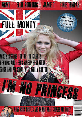
This is my Front cover finished for my music magazine, I have use a large image to occupy a decnet amount of space so that readers are not put off by large amounts of text, this is because my target audience of teenagers would not find lots of text appealing. The colour scheme of red blue and white represents the magazines British theme and the black writing goes well with the solour scheme as it is easy to read and stands out. I have used media conventions such a barcodes, price, dates, pugs, headlines, tagline, skylines and banners and a masthead. These make my magazine more professional and will more likely boost the chances of it being published and distributed. I have included new british artists on my skyline as it relates to my magazines theme which is young and new British music, the banner also includes gossip, this appeals to my audience as many teenagers are interested in gossiping. My taglines are all stories which make you want to read more, meaning more people will want buy the magazine to read into the contents. The headline also does not give too much of the story away also meaning you will have to buy the magazine to find out what the full story is. The pug also does this, influencing people to buy the magazine as a good prize is available which would appeal to many. My masthead is also placed in the top corner big enough to stand out to readers so they are aware of what magazine they are looking at, also promoting the magazine.
Stages of Front Cover

Here is my finished contents page, I have used conventions such as broken down text to make it easier for readers to find what they are looking for. Page numbers have been used to enusre readers can find a certain content in my magazine easily, the issue date is included as are images and subcribtions. Subscriptions are another way I can distribute my magazine, selling more and by offering a cash prize to people who suscribe persaudes readers to do this, making my magazine get my money by selling more copies. The images and layout of my contents appeal more to 16 to 18 year olds as it takes away too much attention to the text which puts off many teenagers, it also makes my contents more interesting and when people may flick through the magazine quickly before pruchasing it it will jump out at them as it is eye catching through the editing of images and layout and colour.
Stages of Contents
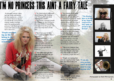
Here is my finished double page spread, the image is effective as the editing use of the dodge tool has lightened the background making her the center of attention and makes the writing easier to read. The use of enlarged quotes also persuade the readers to read the interview as many people do not like large amounts of text, I picked out the most effective qoutes which would ensure people would want to read further into the interview. I have also positiioned my text so that it does not cross the centre line so all text is visible and easy to read. I have also enlarged a quote as the headline as it is from her point of view and will appeal to readers as it gives a sense of comfort and similiarality between the aritst and the readers. The film strip down the side is also to take away so much attention away from the text and its vintage and retro look is up to date with teenage interests today. I have included page numbers at the bottom, real conventions of media and named who took the photography sometimes a case of conventions in media magazines.
Stages of Double Page Spread
For the sketches I have decided to use the skatech with the main image in the center of the page and the masthead on the left hand side, with no picture and text to make it too busy, this is becuase I feel my tagkines and headline and main image will stand out more and my magazine will look proffesional. I have included all conventions of real media products such as barcodes, prices and dates and looked at other music magazine layouts for inspiration. I feel by using this my front cover will be very effective and eye catching, qualities I need for my music magazine to sell.
For my magazine I wanted my font to be appealing to attract attention, I used a website named wwww.dafont.com where thousands of fonts are available, I also used fonts alreayd on the computer for my double page spread. Here are some examples of the ideas of fonts I was going to use....
Fonts
Friday 7 May 2010
From my photograph inspirations, I got an idea of what kind of outfits I would want to use. I have taken Lady gaga as inspiration for the wordrobe, by using very unusual and outrages clothing to catch my readers attention. It also matches he colour scheme of my magazine, giving my magazine a more professional look about it. The use of props use as the musical instruments relates to the genre of my magazine advertising that it is a music magazine. The hair and makeup are also not your everyday style so that it gives off the image that she is famous and a music artist. My music magazine is diverse and therefore I have ranged my outfits so that some appear "rocky" and some appear as the average teenage style which the majority of teens wear today suiting the majority so that my audience is broader and that my magazine sells more copies. The poses that she has used can appeal to both genders as she can seem seductive to the male population of readers and for femals she could be portrayed as a role model, as she is a successful women. Some of my photographs have been taken at a low shot angle so that the camera looks up at my model, therefore she is being portrayed as a role model and superior o the audience, I have also taken some midshot and long shots at her level so she comes across as relating to the audience giving them a feeling that they share things in common. I have also related back to the Lady Gaga inspiration from her video 'telephone' where she appears with coke cans in her hair and twisted the idea by putting kitchen utensils in my models hair so it gives the impression that she is very 'wild' and humourous, good qualities for reading. This will catch my audiences attention as it is unusual and eye catching.
Monday 19 April 2010
Thursday 18 March 2010
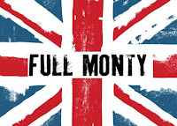
Here is an idea that I am considering for my masthead, from my questionnaire results I have used the preferred colour scheme which was red/blue and white, and used the theme of young british artists. As i have dedicated my magazine to Young british artists I wanted a name for my magazine to be "british" therefore decided that by naming it "Full monty" which is British slang for the entire take, all that is desired, this title is showing my audience that this magazine's content is all of what they want included in their magazine and alos giving them they affect that it is what they 'need'. I used the union jack as it represents British culture and used a slighty more edgy version of it, to make my magazine more interesting and perhaps even "rocky". My colour scheme also does not relate to any particular genre of music and from my poll results it seems the best way to produce a successful magazine would be to do a more diverse magazine. I chose to use this font as it fits in with the rough union jack look.
Thursday 11 March 2010
Thursday 4 March 2010
Theorists were not asking how the media effects audiences, but how were the audiences using the media. They suggested that audiences had specific needs and actively turned to the media to consume various texts to a satisfaction of these needs. The audience were seen as active, as opposed to passive audience. This theory acknowledged that the audience had a choice of texts from which to chose from and satisfy their needs. While acknowledging that the audience are active and chose what to watch, the Uses and Gratifications theory is for understanding that audiences also have limitations. The theory still suggests that the audience will read some aspects as the same. It does not consider how the messages are interpreted or any other factors affecting the audience’s interpretation. In conclusion the theory is based around the audience seeing what they do with the media rather than what the media does to comsumers, allowing the audience to find out how media effects them. This theory ensures that the audience are in charge of choosing certain media which suits their needs, an example of this may be that if a consumer enjoys listening to rock music they wouldn't want to get a magazine such as smash hits which is a very girly magazine and focused on pop music, they would rather go with a magazine such as NME or KERRANG! which may stand out as this genre due to image, text and colour.
Monday 1 March 2010
Thursday 25 February 2010
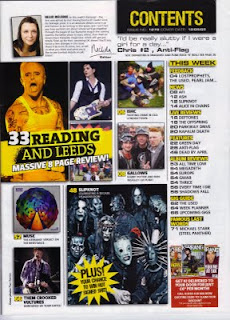
Kerrang have stuck to three main colours, black white and yellow. These colours are used frequently throughout the magazine, they are bold and striking which catches audiences attention. The yellow is also used as a highlighter to emphasize certain points, this is a suitable colour for this as the writing is still visible.
There are many images used on this contents page all showing band members giving the audience indication of who will be featuring in the magazine. All the artists in the images appear to be rock artists, showing KERRANG is a rock music magazine, the use of more than one image and them being scattered accros the left hand side of the page also makes the magazine look less formal and more like a rock music magazine.
The contents of the magazine has been narrowed down into groups to make it easier for the readers to find the page number. An enlarged quote is used using very informal language, "I'd be really slutty if I were a girl for the day", this is quite a humourous quote and will make readers want to read further into the magazine. Certain text is in a bigger font, this is so that the audiences attention is drawn to them, for example the reading and leeds festival news, a music festival which Kerrang readers would be interested in.
This magazine has included an editors letter which we have not seen in Vibe or NME magazine, this is to give the audience almost a 'friendship' between the editor and themseleves, also again making the magazine less formal. The use of many images using most of the page also draws in attention and the text is set out easily to be read.
Wednesday 24 February 2010
 Unlike many other music magazines Q magazine's style seems more formal and neat unlike names such as NME and KERRANG who tend to use many colours, images and chaotic designs. The image used relates to the gothic theme as the church used in the background is considered to be a gothic building as many were built during the gothic era. The image is also taken on a slight slanted angle, gothic style is a breakaway from many boundaries and was something different therefore this connotes the difference of gothic style. The pose of the man is directly infornt of the church and the main focus of the spread, his unusual and relaxed style pose also shows he is the main focus.
This double page spread uses just black and white colour, this could be as Q magazine often keep their magazines simple and more formal, however it oculd also be to empahsize the fact that it is of the gothic genre, as it is known to be dark. The white text on the black background also makes the text stand out and catch the audiences attention.
The text used is based on a black background and written in white so that it appeals to the reader and stands out. Unlike NME and KERRANG magazine, Q tends to include more text in their spreads and in a small font, the word Gothic is also written in a different font style which relates to gothic style. The text also starts with a dropped capital, certain words are also highlighted to emphasize their importance to the spread.
The design of this magazine is set out that the image takes up a majority of the magazine covering the right side and continuing onto the left. This attracts the readers attention as it may also manipulate the readers into not believing that their is that much text which may put some people off of reading. The dark colour, images and text also gives of the impression of it being a gothic article.
Thursday 11 February 2010
 The image on this double page spread shows who the article is about, it takes up a large amount of the spread showing Lily Allen's importance. Her dark hair and makeup and pale skin with the red checkered shirt matches NME house style colours. The camera angle is also looking slightly up at her and her body is position leaning slightly forward, this shows she is perhaps superior and important. However this is ambiguous as when reading the headline, it is like she is telling the audience a secret and her body position almost looks as if she is leaning forward to tell us a secret.
The birght white colour in the background of the magazine in contrast with the bold black and red colours makes the text and image stand out, making them the audiences main focus in the spread.
The design of this magazie has been set out so that the image takes up the whole right side of the spread and the headline also is very large and takes up a majority of the left hand side of the spread, this is perhaps so that the readers are not put off by large amounts of text. The design of this spread gives off a fun and creative feel through the fonts and placings of text and images, perhaps attracting the younger target audience with its authentic feel.
Tuesday 9 February 2010
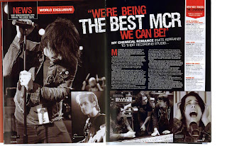 The band members that are shown in this double page spread seem to be all male, this could suggest that they are male role models, this is shown through camera angles as the image of the lead singer shows him at a low angle, this connotes that they are a positive impression on a particular audience, perhaps young males? All images shown in this article are black and white, this is perhaps because it indicates this band is a punk/rock band and it goes with the genre of their music.
 Thursday 4 February 2010
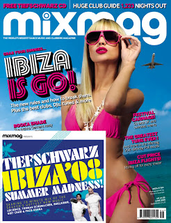
For this magazine it has used brighter colours to rock magazines such as NME and KERRANG, the bright colours indicate that this magazine is not a rock music magazine and could be for a more upbeat type of music such as dance music. The bright colours give off a bright and happy mood, for example the bright blue sky and bright pink and yellow, they could be associated with happiness. The main image on this front colour also gives off this impression and it shows a women on holiday where most people are happy at whilst they are on holiday. For the design of the magazine the words and image fit together as the largely written information on the Ibiza summer madness CD and text about summer parties, the image fits with this as the women in the bikini is dressed for a holiday in the summer, the aeroplane in the background of the image also suggests the music magazine is based around club and dance music. The font also seems to resemble perhaps lighting which would be used in clubs as it is styled similar to a certain lighting effect. The masthead also stands out in contrast of the bright white and blue, making the magazines name clear and attract the audiences attention.
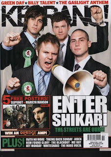
The colours used are an off white, black, green and red, these are all unisex colours and are also quite dark and ‘grungy’ colours, this shows it is a rock music magazine as these colours give off that impression. The colour scheme of the magazine matches the image. The masthead KERRANG looks as if it has been smashed in the lettering, this suggests it is a rock music magazine as it could be related to the typical rock band who smash their instrument and are ‘head bangers’, the exclamation at the end of the masthead title also emphasizes loudness, related to loud rock music.
The image used is a rock/scream band, this relates to the genre of the magazine. The rosette which each member of the band is wearing with the dragon in the middle is the bands logo, which also matches the colour scheme of the magazine cover. The use of the mega-phone also suggests that the band are loud and megaphones are used to perhaps shout down and get someone’s attention, this relates to Enter Shikari’s style of music. It also relates to the genre of the magazine.
The band are all acting out certain movements with their hands, this movement can be seemed as ‘hard’ and harsh almost like the genre of music. The words on the front of this cover are large and bold, the connotation of this could be that rock music is quite loud and striking the font size and type could reflect the genre of the music magazine, relating to the readers interests. The size and layout of the text is easy to read at first glance, this is more likely to catch readers’ attention. There is not a lot of text in this front cover, however the text which is on the cover includes the cover lines which is the main story inside the magazine, strap lines which only mention band names this could intrigue people and make them want to read further by just focusing on main story lines. The words “the streets are ours” come across as cocky, loudmouthed and seem appropriate as it is a rock band saying it, whereas if a youth was to say this it may seem inappropriate.
My overall impression of this front cover is that the sky line gives us an indication of who is featured in the magazine, as does the text at the bottom of the magazine, which could be seen as subheadings? However it only mentions the names of the artists and does not state what information on them will be included in the magazine. The main point of focus is the large and striking image which gives the audience a clear understanding that this issues main article is on enter shikari. The way the layout, design, text, language and image all have been designed to appeal to rock music listeners as they represent that specific audiences interest through connotation.
Thursday 28 January 2010

By using black, red and white these colours are very bold and edgy, they are also quite your typical rock band dark colours, showing it is a rock magazine. These colours are aimed neither at girls or boys, showing it is a unisex magazine. The image on the front cover fits the colours used for the magazine; Cheryl Cole’s tongue has also been edited and made a brighter red colour to match the colour of the red used in the masthead, this makes the colours stand out and come across bolder and more effective. The words “Cheryl Cole rocks” match the image as she is styled according to the rock genre. The image portrays the genre of music, this appeals to typical rock music listeners, however Cheryl Cole is an r’n’b/pop singer therefore this broadens Q magazines audience, this could also be a reason as to why Q magazine has been named the UK biggest music magazine. The use of this image also attracts males as she is posed in a sexual way and also appeals to females as Cheryl Cole is very popular in the media at the moment and could be seen as a role model to females. Her hair and makeup has been made to look like a stereotypical ‘rock chick’ and also her pose is very sexual which perhaps appeals to male readers. Her makeup matches the colour scheme of Q magazine, you could also say the colour of her tongue has been editing to look more red to match the colour scheme and also because of her sexual pose it has been touched up to stand out more in the image. The use of Makeup and hair also shows us the genre of the magazine, such as the dark eye shadow and bright red lips. Black and red are used frequently in the rock music genre. The use of pun, “3 words- Cheryl Cole rocks”, her song title 3 words currently released, then relating it back to Cheryl Cole in the image and what the content inside the magazine is. The strap lines include the names of the bands which are key inside the magazine, these are mostly rock and indie bands, however there are two rnb singers also on the front cover so it perhaps shows that also Q magazine focuses mainly on rock and indie music but it also has some diversity. You can identify a majority of the content at a glance and the size and layout of the words are clear. The language of Cheryl Cole rocks appeals to readers as she is a more rnb/pop singer, therefore it is interesting to see her associated with a different genre of music. The pun also stands out to readers. The bold striking colours and design of the magazine stand out, for example the masthead overlaps the image whereas most magazines do not however the image still stands out. A good indication of what is inside is giving in the strap lines and it addresses a main audience of rock music listeners however also shows diversity by including other artists.


